 View Resume
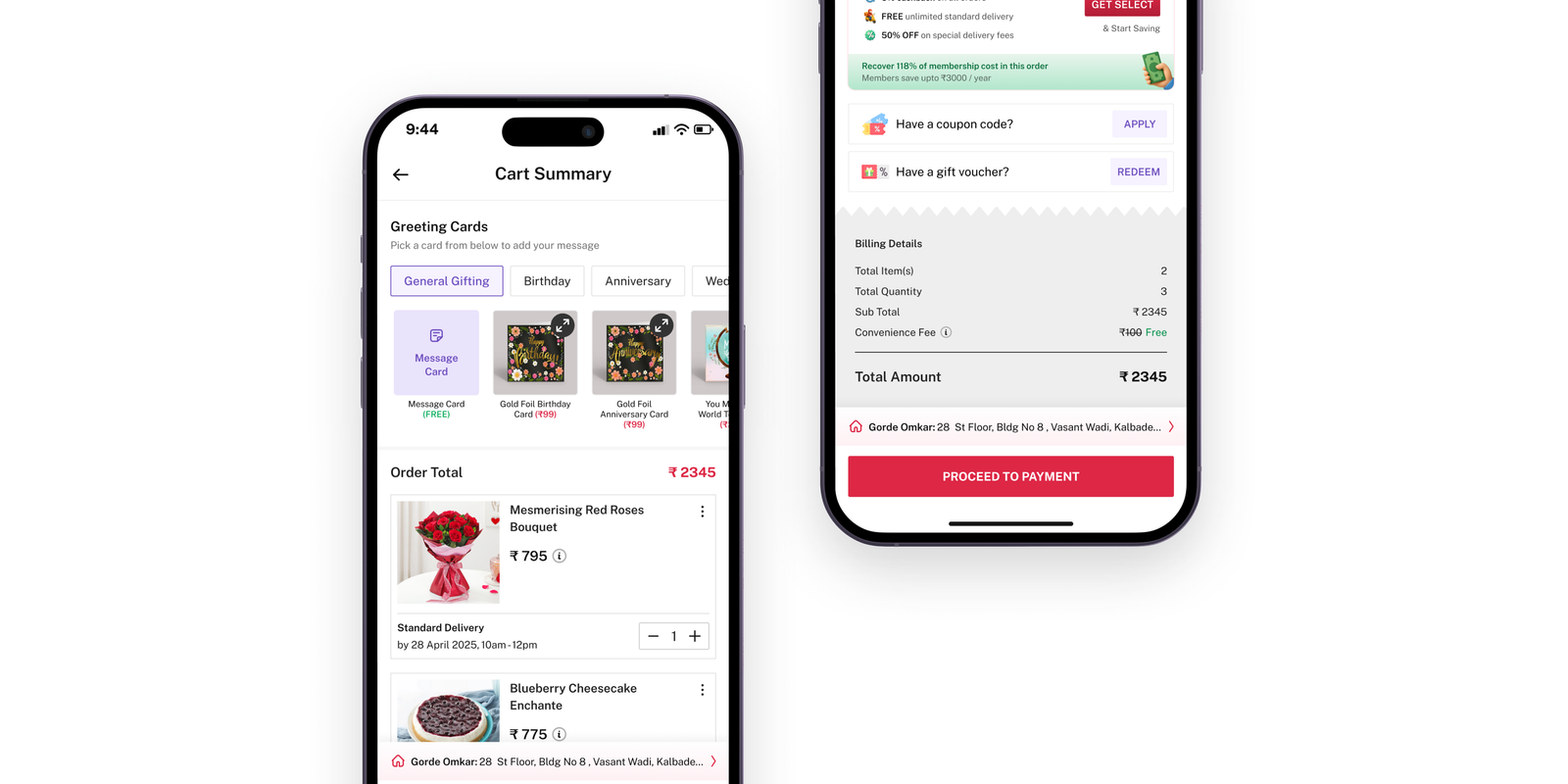
IGP is an Indian gifting platform where people buy cakes, flowers, and personalized gifts for birthdays, anniversaries, and celebrations. Aside from personal occasions, a large chunk of orders comes from seasonal events like Rakshabandhan, where users buy rakhis and gift hampers. Gifting often has hard delivery deadlines, so speed and clarity during checkout matter a lot.
Reducing checkout steps was Phase 1 of a broader push to make product discovery and ordering faster across the platform. While IGP isn't a quick-commerce app, users shouldn't feel exhausted trying to send a gift. When we mapped out the touchpoints based on effort versus return, updating the checkout flow offered the highest immediate value.
Our primary goal was simple: reduce the time it takes for a user to place an order without dropping our overall conversion rate.
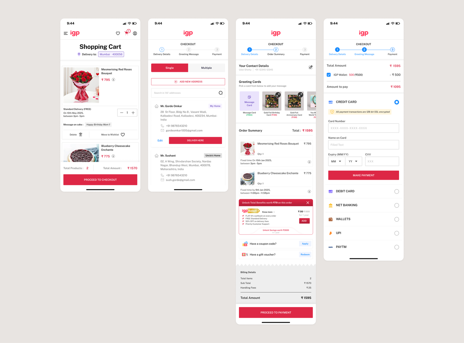
The original checkout had 4 distinct screens:
When looking closely at Cart and Order Summary, almost all the information was duplicated. The only real reason Order Summary existed as its own standalone step was to sell greeting card add-ons. If two screens carry identical information, merging them is an obvious starting point.
Merging Cart and Order Summary made sense, but we still had to solve how address selection fit in. At IGP, address selection isn't just about picking a location—it's tied to product deliverability.
A single cart might contain a same-day hand-delivered cake alongside a courier-delivered personalized mug. If deliverability is checked only after address selection, forcing the user into a separate screen creates unnecessary back-and-forth if an item in their cart turns out to be unavailable for that pincode.
OLDER 4 STEP CHECKOUT
To find a cleaner way to handle address selection, we benchmarked flows across traditional e-commerce and quick-commerce platforms. E-commerce apps typically treat address selection as a dedicated step. Quick-commerce apps (like Blinkit, Zepto, and Swiggy), on the other hand, treat address selection as an inline sub-step right inside the cart summary. We realized that embedding address selection directly into the Cart Summary was the right approach for IGP:
ADDRESS SELECTION IN OLDER FLOW 4 STEP CHECKOUT
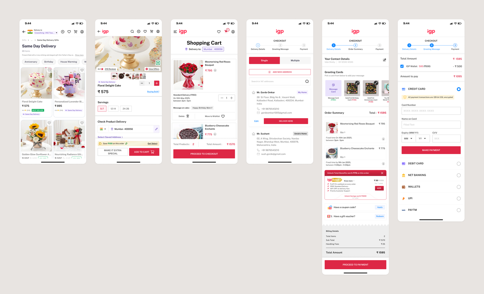
ADDRESS SELECTION OLDER FLOW 4 STEP CHECKOUT
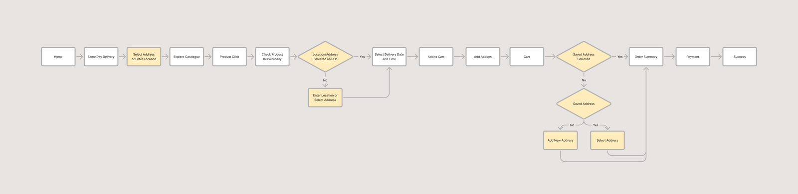
EXPLORING ADDRESS SELECTION IN NEW FLOW DRAFT
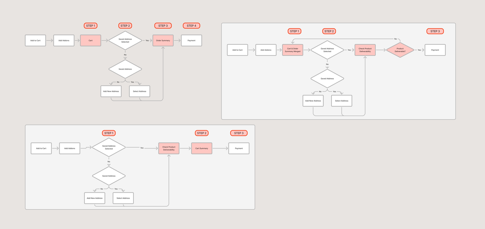
We made a deliberate choice to launch 2-step checkout only on Mobile Web and Native Apps, keeping the Desktop checkout on the old 4-step flow. Here’s why:
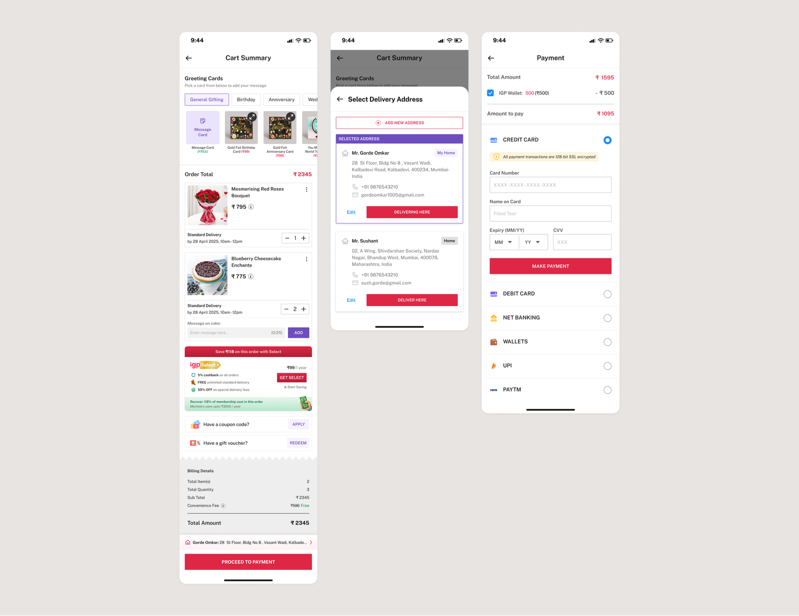
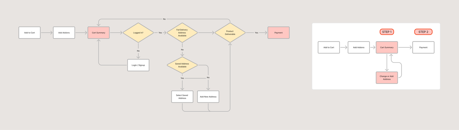
In the updated design, users do everything on a single screen before payment:
UPADTE 2 STEP CHECKOUT - FINAL DESIGN
UPADTE 2 STEP CHECKOUT - FLOW
To evaluate the new checkout flow, we looked at two sets of data: a controlled 50/50 A/B test in December 2025 to prove direct causality without seasonal noise, and the platform metrics once we scaled to 100% of mobile users in January 2026.
| Metric | Default (4-Step) | Variant (2-Step) |
|---|---|---|
| Cart to Payment Conversion Rate | 43.72% | 46.11% |
| Cart to Transaction Conversion Rate | 37.15% | 38.99% |
| Median Time: Cart to Payment | 5.7 minutes | 3.8 minutes |
| Median Time: Cart to Transaction | 9.2 minutes | 8.3 minutes |
| 25th Percentile Time: Cart to Payment | 2.4 minutes | 1.1 minutes |